Abroadwel is a home finder app for students abroad to find and communicate with trusted host families all in one place. This was a personal UX/UI product design case study.
Role:
UX/UI Designer
Industry:
Accommodation App
Duration:
2 weeks
As per discovery research, the primary concern for students and parents preparing for study abroad was finding reliable host families, aka homestays. Students often feel apprehensive about adapting to a new environment and culture, while parents seek assurance that these accommodations are safe.
So, I asked the following question:
How might we build trust with students and parents, and help them feel safe and confident they are making informed decisions about where they want to stay?
Goals
Business Goals
Strengthen the value proposition
User Goals
A delightful and consistent user experience that reduces technical debt
Design Goals
Create a platform that builds a sense of trust, and encourages transparent communication
Challenges
Reliability and Transparency: Creating robust features that help students find reliable host families abroad and communicate.
User-Centric Design: Designing an intuitive interface that caters to students and parents using a mobile-first approach for its access on the go.
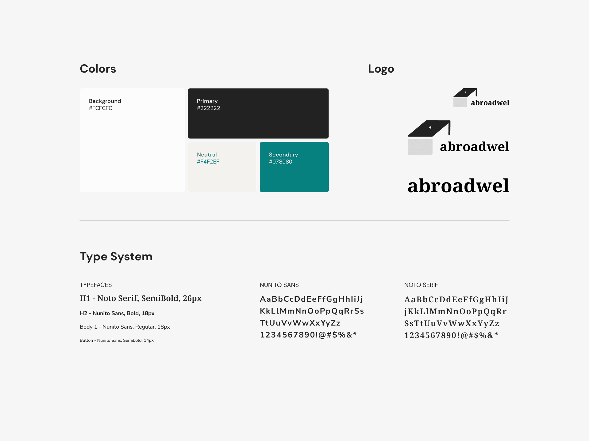
Brand Identity: Designing a visually appealing app that authentically reflects the target audience, and is competitive in the market.
My Approach
Discovery
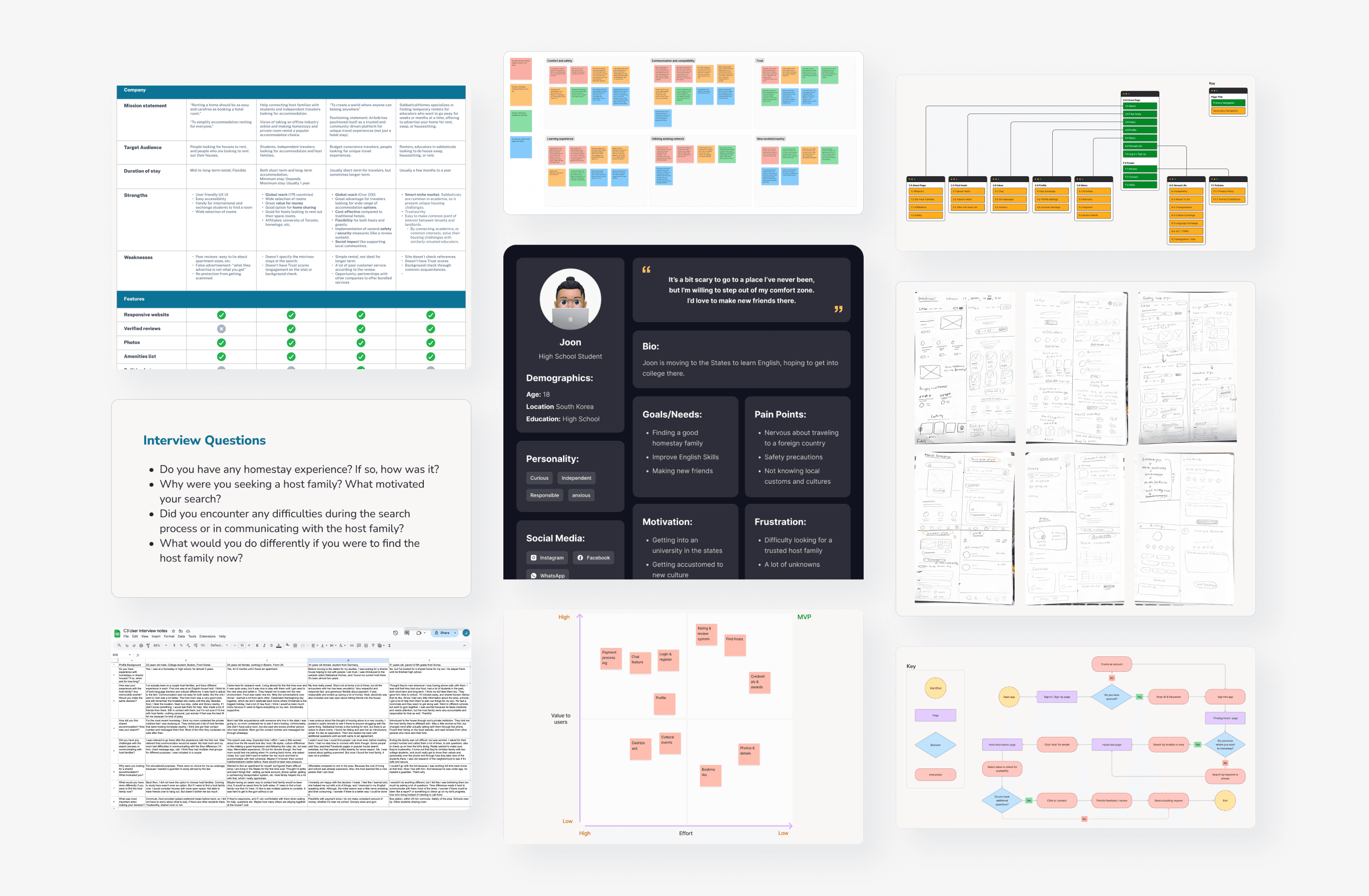
User Interviews: Conducted in-depth interviews with abroad students to understand their current frustrations and needs with finding accommodations in foreign countries.
Market Research: Conducted thorough competitor analysis to understand user needs, competitor offerings, and emerging trends in accommodation app development.
User Persona Development: Created detailed user personas to guide design and feature prioritization.
Design
Ideation: Created sketches and wireframes after establishing the goals and requirements for the app.
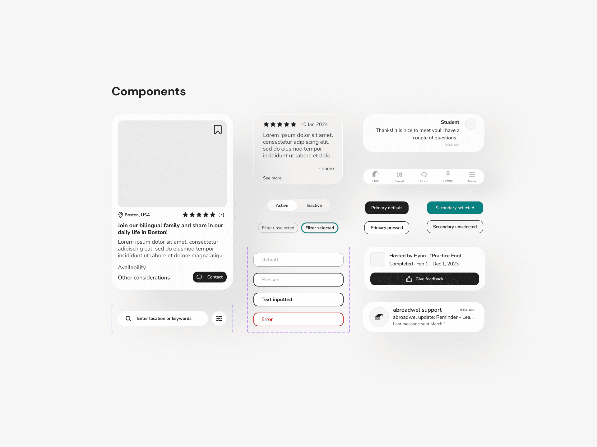
UI/UX Design: Designed a clean and intuitive interface with easy navigation and visually appealing graphics to motivate users.
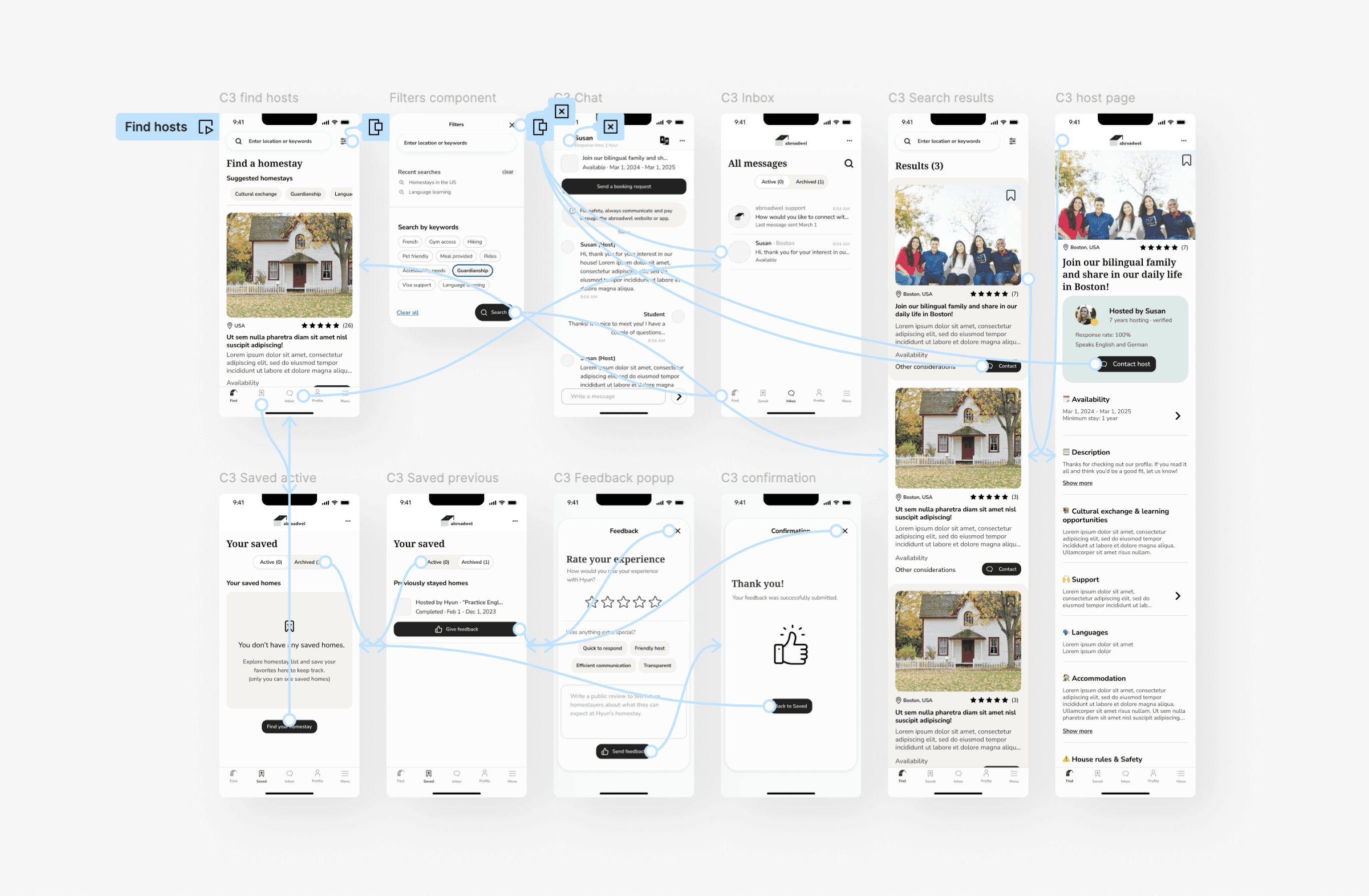
Feature Implementation: Developed and integrated key features like an advanced search, chat feature, and rating & review system to build an MVP.
Test
User Testing: Conducted extensive usability testing with target users to gather feedback and refine the app interface and functionality. For the intent of this test, I created tasks to test out the key features to ensure a seamless user experience. A total of 6 testers participated.
The test was initially conducted unmoderated via Maze, by having people answer simple questions and go through three task flows. Then I followed up with some testers to ask more questions to better understand the user journey.
Tasks tested:
1. Searching for a homestay
2. Contacting the host
3. Giving feedback to the homestay host
As people value transparency per user research, I implemented the key features envisioning a platform that facilitates transparent communication that could help strengthen the relationship between host families and students. After many iterations, the prototypes were created and tested.
Feedback
All users displayed positive sentiments about the app and would want to use it in the future. The results and feedback from the testing helped me to identify opportunities for improvement.
Action Items (In order of most significant to least significant):
Filter and search function - Originally, the search and filter functions had separate screens and many users were confused by multiple tabs and options. Now merged as one while still offering users the ability to change the parameter of their search.
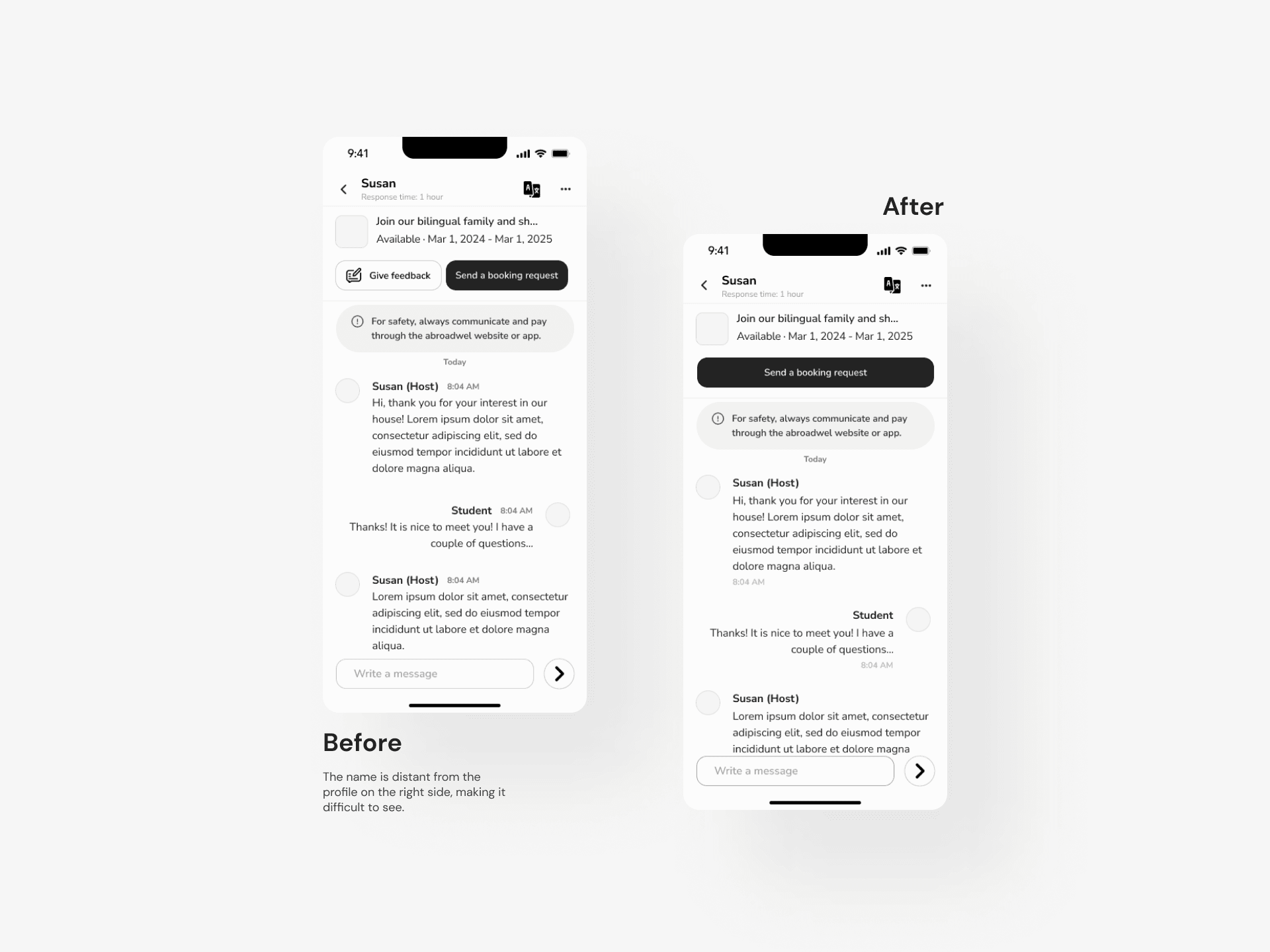
Chat function - The placement of the profile picture and the time in the chat box is improved. The CTA button is enlarged for more emphasis.
Spacing - Line spacing is improved to make it more consistent and feel more approachable.
Continuous Improvement: Plan enhancements to better adhere to WCAG standards in terms of the accessibility of the design, and improve user experience based on feedback and evolving trends.
Expansion: Explore partnerships with institutions to further enhance trust and user satisfaction.
Working on this personal UX/UI project taught me the importance of setting limitations in my design and prioritizing user goals when delivering a functional MVP, and how it can contribute to the result. Minimal resources were used, saving time.
