Re-designing a e-commerce website for a new jewelry shop. Their vision is to blend artistic expression with craftsmanship, producing beautiful pieces with commitment to environmental and social responsibility.
Role:
Web Designer
Industry:
Jewelry Retail
Duration:
4 weeks
Our client, Arauz Jewelry, a new jewelry artist specializing in high-quality, handcrafted pieces, asked me to create a refined website platform that showcased her original jewelry collections. The client wanted a website design that reflected the brand identity in a minimalistic way.
Goals
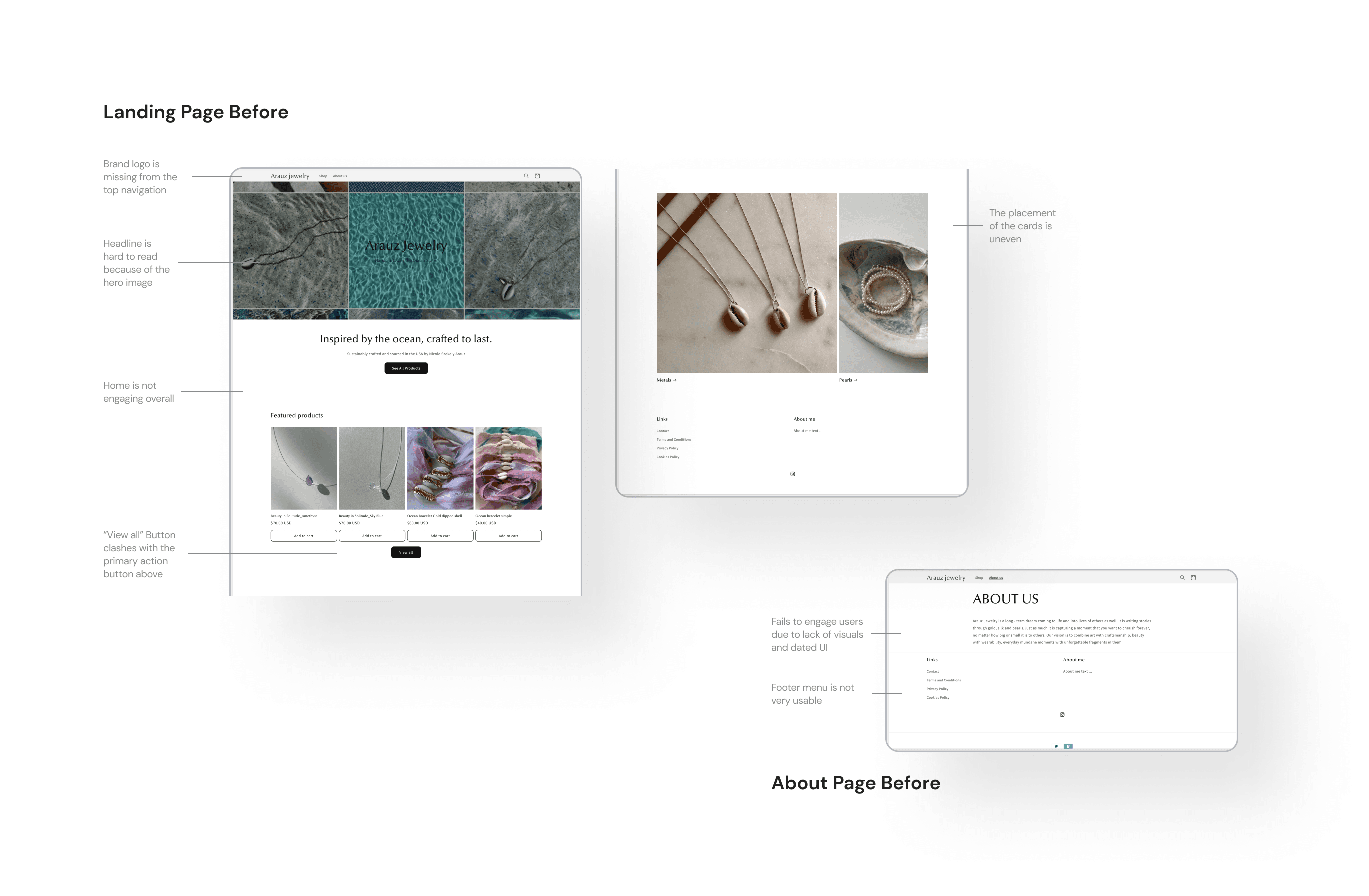
The client approached me hoping for a revamp on the website's aesthetics that enhance the brand's online presence, I wanted to take it further and make a more user-friendly website.
What: Create a user-friendly design that offers an engaging user experience by improving the organization system.
How: By developing an easy-to-understand navigational structure and reducing the cognitive load.
Why: To increase conversion rates for better sales.
Challenges
Visual & Brand Identity: Designing a polished website that highlights the craftsmanship and quality of client’s work, and aligns with their values and current brand identity.
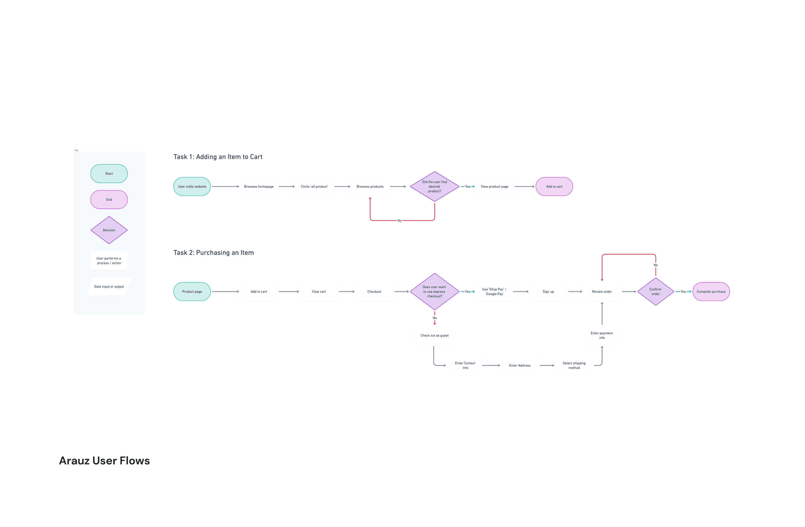
User Experience: Creating an intuitive interface that allows users to easily browse collections, view detailed product information, and make purchases.
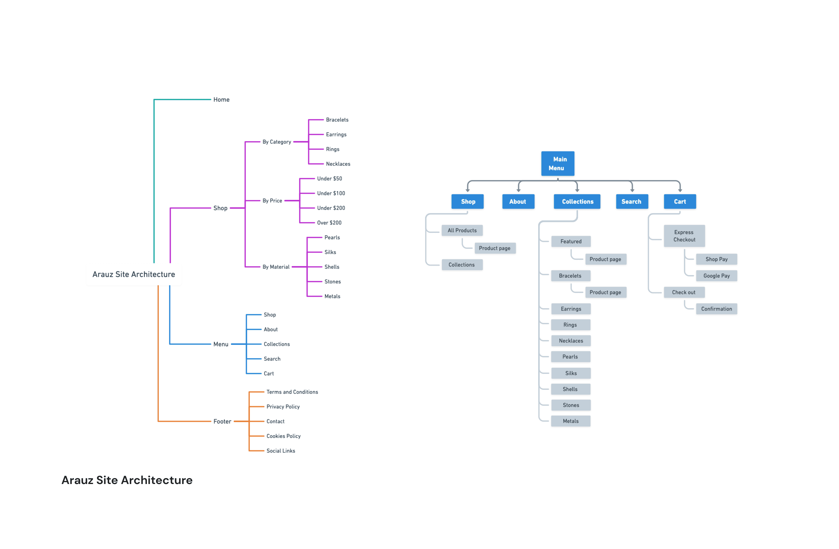
Information Architecture: Implementing a robust e-commerce system with efficient inventory management and improved organization to showcase the products with more consistency.
My Approach
Discovery
Stakeholder Interviews: Conducted in-depth discussions with the client to understand their brand, target audience, and specific requirements.
Market Analysis: Researched competitors and current trends in jewelry e-commerce websites to identify key features and design elements.
Design
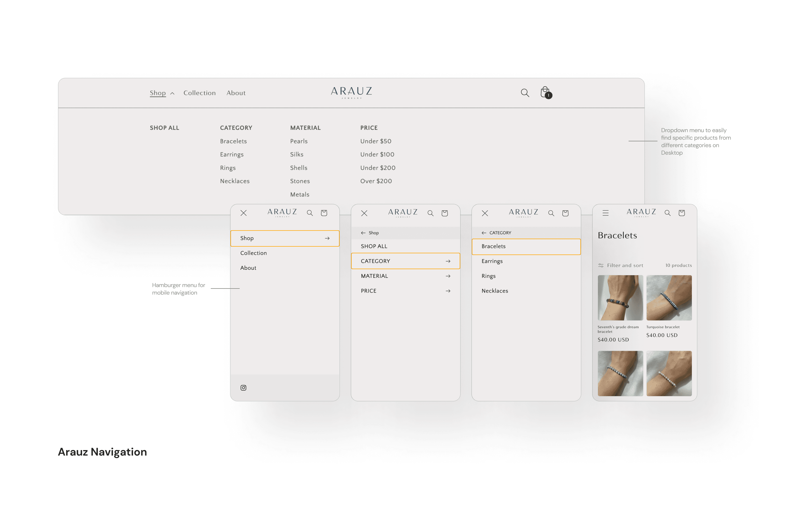
Navigation System: Re-defined information architecture and the general flow for an easy navigation system.
Visual Designs: Although its logo and primary colors were already in place, it lacked a digitally optimized design system and visual designs that could elevate the website's visuals.
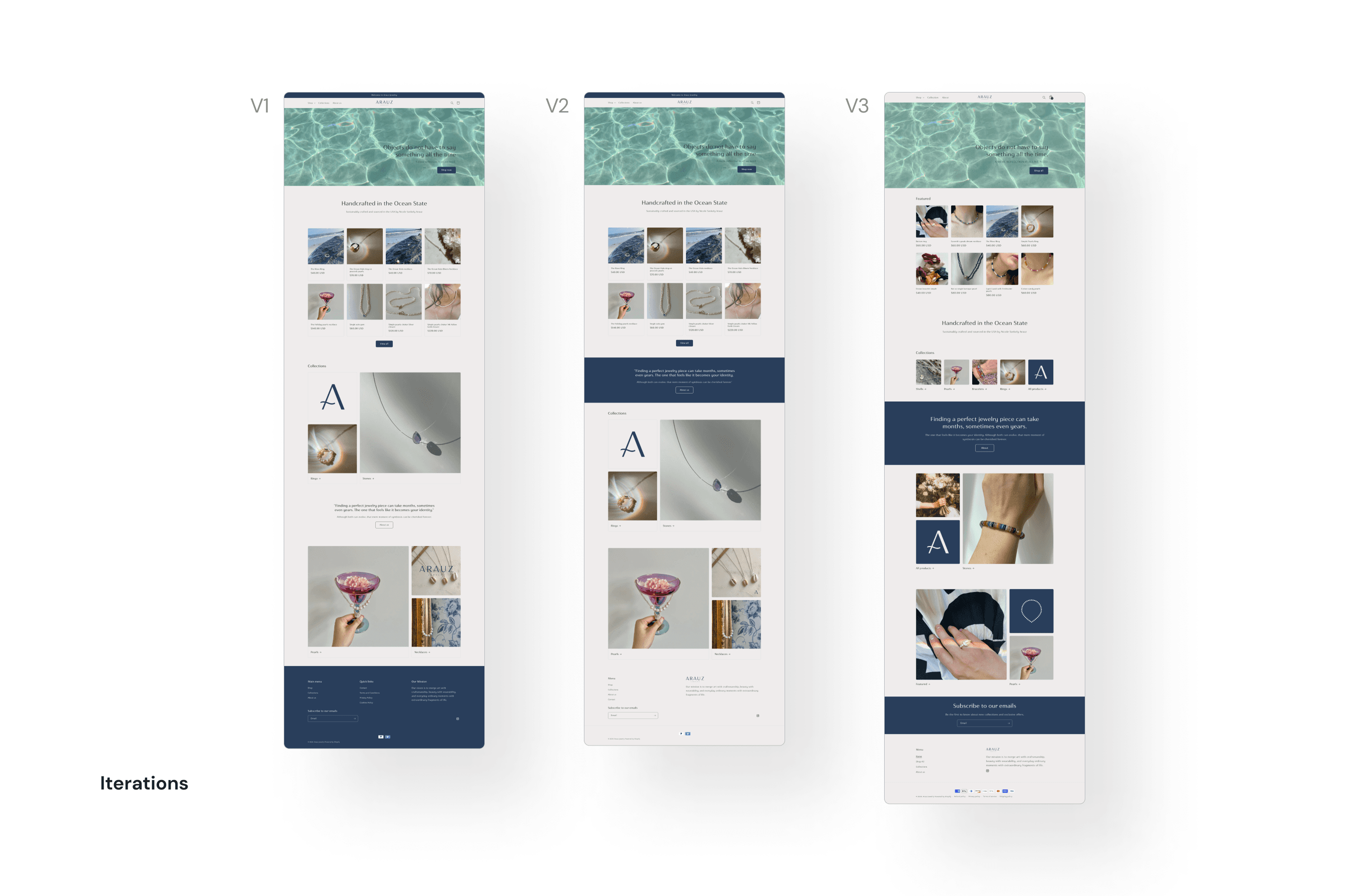
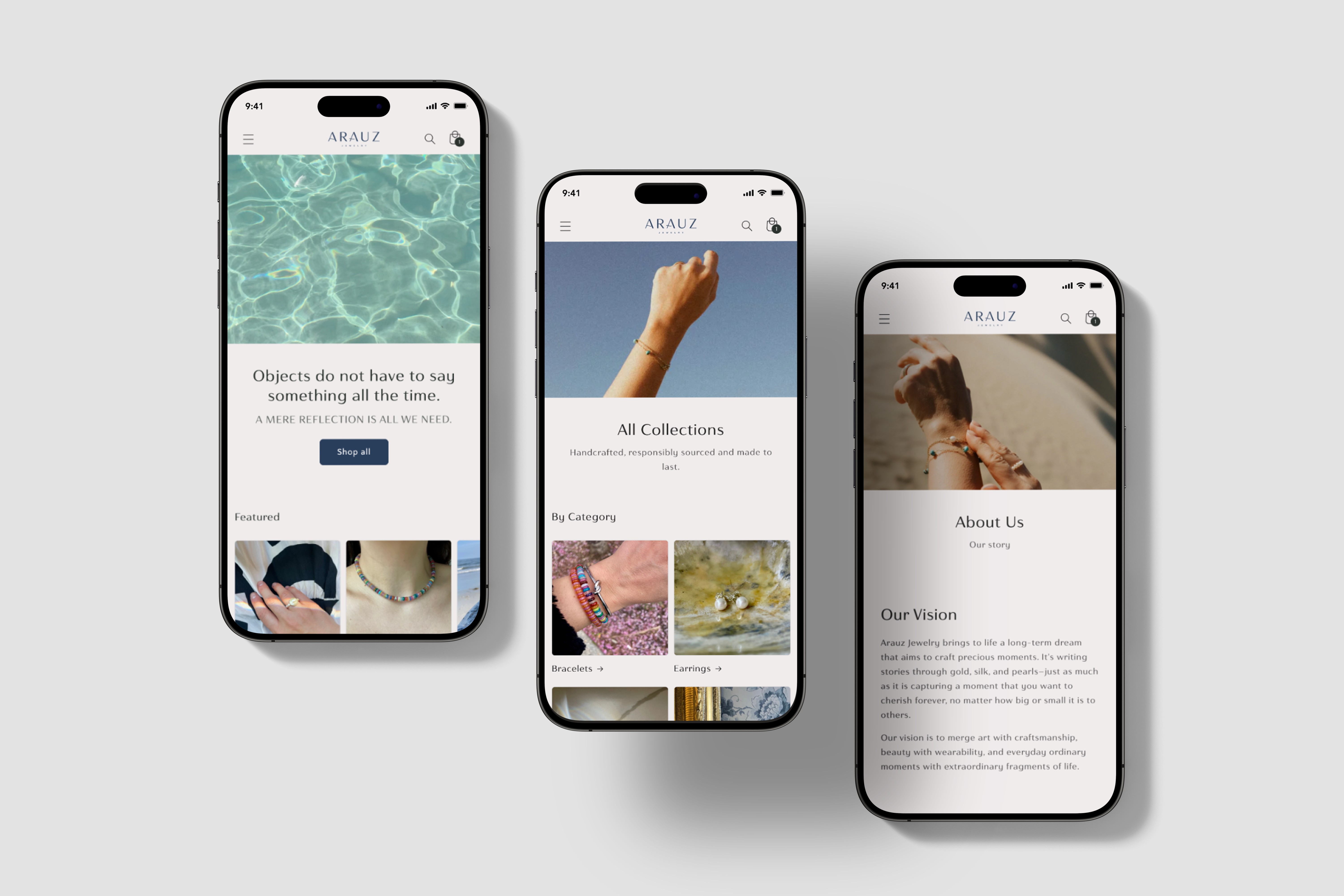
UI/UX Design: Designed a clean, modern, and visually appealing interface that emphasizes the quality and uniqueness of the jewelry pieces.
Test
User Testing: Conducted usability testing with potential customers to gather feedback and refine the user interface and shopping experience.
Performance Optimization: Ensured fast load times, smooth navigation, and compatibility across various devices and browsers.
The e-commerce website launch was highly successful, significantly increasing customer engagement and merchandise sales. The site's aesthetic appeal and intuitive design received positive feedback from both the client and their customers. Key metrics such as average session duration and click-through rates showed marked improvement (62% higher in the next quarter after launch).
Continuous Improvement: Plan regular updates and enhancements to keep the website fresh and engaging.
Expansion: Explore additional features like customer reviews, and virtual try-on tools to further enhance the shopping experience.
Through strategic planning, meticulous design, and clear communication, I delivered an e-commerce website that exceeded the client’s expectations. Auditing the website was helpful for me in creating an action plan to improve the website’s visuals while it was difficult to refine the experience of a larger audience without a lot of actual website users at pre-launch. In the future, I want to spend more time improving the website’s key metrics through more research and gaining new perspectives on user behavior and what customers value the most.
